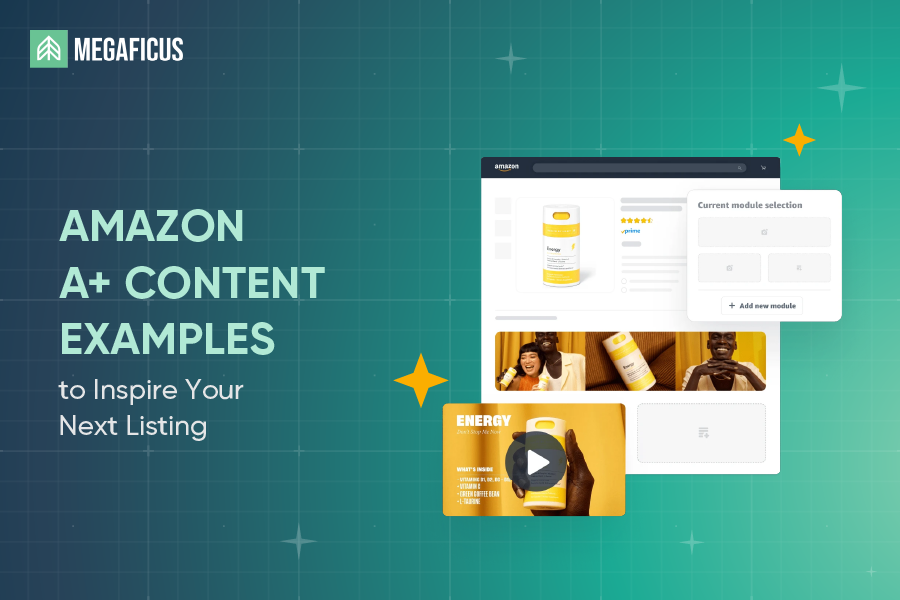
What if a single listing upgrade could cut your return rate, answer buyer questions before they ask, and push hesitant shoppers to checkout? That is exactly what well-executed A+ Content does. In this guide, Megaficus breaks down real Amazon A+ Content examples from top brands so you can apply the same logic to your own listings.
Quick Summary
- Amazon A+ content supports 17 module types, with a maximum of 5 modules per detail page. Each module has its own image size requirements, character limits, and structural rules that sellers must follow before building any layout.
- How to create Amazon A+ content in 3 steps: The entire setup is managed within Seller Central through three steps: access the A+ Content Manager, select a content type, then build and apply your module layout.
- 8 tips for creating effective A+ content: Balance text and images, include technical specs, use comparison charts, tell your brand story, and leverage Premium features like video, hotspots, carousels, and Q&A sections to maximize conversions.
Module Layout Examples
Each module type comes with its own image size requirements, character limits, and structural rules. Sellers need to know these constraints before building or reviewing any A+ Content layout.
Regardless of which module type you choose, all A+ Content layouts follow a shared set of rules:
- Maximum 5 modules per detail page
- 17 module types available to choose from
- All images: JPG or PNG format, max 3 MB per file, minimum 300 DPI for print-quality sharpness
- Text embedded directly onto images is discouraged due to readability issues, especially on mobile
- Do not place text inside the background image for overlay modules; use the overlay text box instead
Module-specific image minimums:
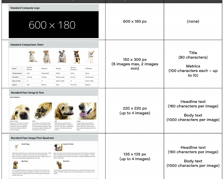
| Module | Minimum Image Size |
|---|---|
| Company Logo | 600 x 180 px |
| Image Text Overlay | 970 x 300 px |
| Header Image Text | 970 x 600 px |
| Single Side Image | 300 x 300 px |
| Image Sidebar | 300 x 400 px (main) / 300 x 175 px (sidebar) |
| Three Image Text | 300 x 300 px |
| Four Image Text | 220 x 200 px |
| Four Image Text Quadrant | 135 x 135 px |
| Comparison Table | 150 x 300 px |
Text and content limits by module type:
| Module | Key Limit |
|---|---|
| Header Image Text | Body text: up to 6,000 characters |
| Product Description | Body text: up to 6,000 characters |
| Text Module | Body text: up to 5,000 characters |
| Single Image Highlights | Bullet list: 1–8 items, 100 characters each |
| Tech Specs | 4–16 rows; spec name: 30 chars; definition: 500 chars |
| Comparison Table | Up to 6 product columns, up to 5 ASINs |
| Image Text Overlay | Headline: 70 chars; body: 300 chars |
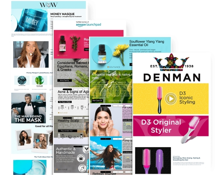
10 A+ Content Examples From Top Brands
Visual presentation drives purchase decisions more than any other factor, which is why top-performing brands on Amazon treat A+ Content as a core conversion tool rather than a cosmetic add-on. The three examples below show how established brands structure their layouts and what sellers can learn from each approach.
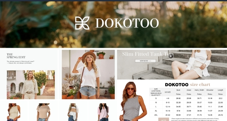
Dokotoo
Dokotoo opens its A+ Content with video modules that place lifestyle footage front and center, showing customers how products look and move in real settings before they read a single line of text.
Supporting image modules, then break down key product features with descriptive copy alongside each visual. A sizing chart is placed at the end of the content flow to help customers finalize their selection without leaving the page.
For apparel brands, this sequencing works because it addresses fit and styling context first, then resolves the last practical objection at the point where purchase intent is highest.
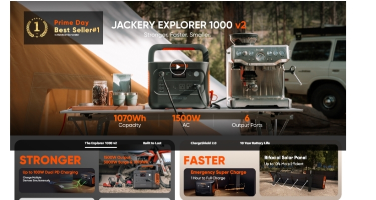
Jackery
Jackery uses A+ Content to serve two goals within a single listing:
- Brand trust: The content opens with the brand’s founding story, explaining its mission to help outdoor enthusiasts access clean energy sustainably, establishing an emotional connection before any product information appears.
- Product education: Multiple Premium carousels with lifestyle imagery communicate capabilities at a glance, followed by a technical specifications table, an FAQ section, and a comparison chart for evaluating different models side by side.
For technical or higher-ticket products, layering brand story with specifications and comparison data addresses both emotional and rational buying criteria in sequence, while the FAQ placement near the comparison chart reduces return risk by answering common questions at the point of highest intent.
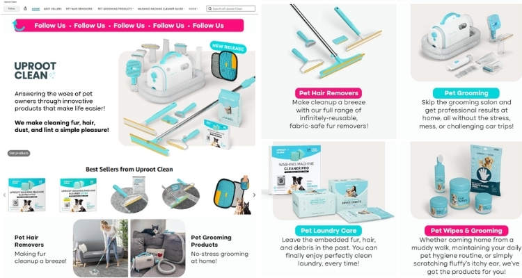
Uproot Clean
Uproot Clean leads with a Brand Story module built around a relatable origin: the brand was created out of direct frustration with existing pet hair cleanup solutions. Framing the product this way establishes credibility before any feature is mentioned.
The content then moves through three distinct stages:
- Videos and carousels demonstrating product use across different scenarios
- A Q&A section addressing common questions about the brand and products
- A comparison table covering different products in the line
For brands solving a specific pain point, this structure works because the origin story does the trust-building work upfront, while the latter half systematically removes every remaining objection before purchase.
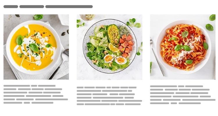
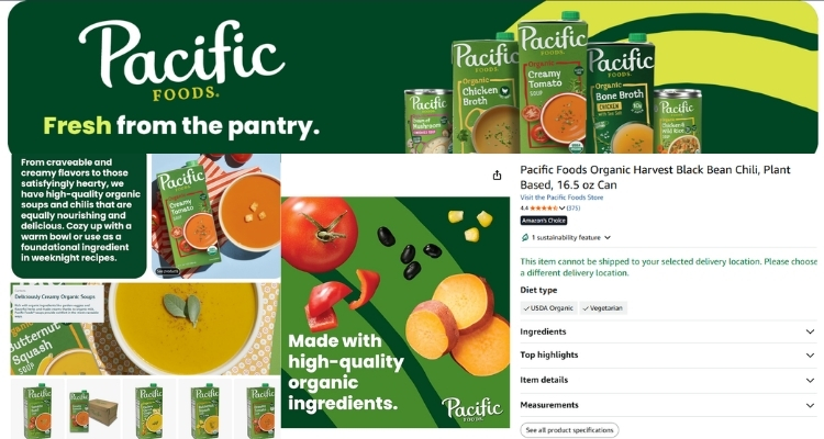
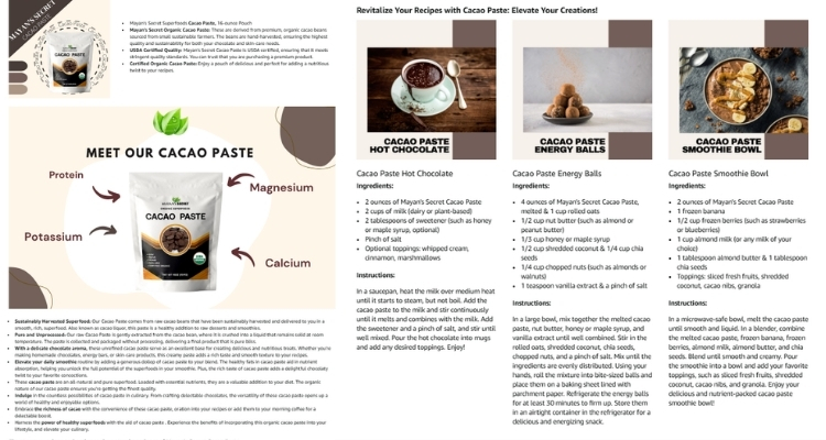
Pacific Foods
Pacific Foods anchors its A+ Content around a single, well-chosen recipe module that shows the product doing exactly what it was made to do. The layout separates ingredients and instructions into distinct visual blocks, with a finished-dish image placed prominently to give the content an emotional pull before the customer reads a single word of copy.
For food and beverage brands, this sequencing resolves a practical objection that product images alone cannot address: the uncertainty around how the product actually gets used. By answering that visually and concisely, Pacific Foods removes the hesitation that often stalls a purchase at the point of decision.
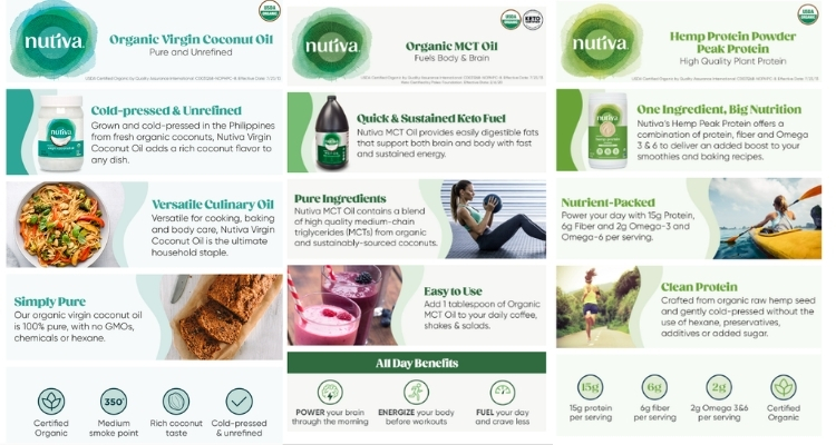
Nutiva
Nutiva treats its A+ Content as a direct extension of its overall brand design system. Brand colors carry consistently across every module, and the copy is written to match the tone its target audience already responds to, keeping the entire experience cohesive from top to bottom.
Beyond the visual consistency, the layout is also built with mobile display as a priority, with text kept out of images and visual elements sized to hold up on smaller screens. For health and wellness brands with a defined customer identity, this level of design consistency does conversion work that product copy alone cannot replicate.
Kiva
Kiva uses its A+ Content to eliminate the uncertainty a potential buyer may feel about using an unfamiliar product. The layout breaks the process down to three steps: Add, Blend, Stir, and supports each step with clean infographics that make the instructions immediately scannable without requiring the customer to read through a block of text.
For brands selling products in categories where unfamiliarity creates hesitation, this approach removes the friction that causes browsers to leave without buying. When a customer can confirm at a glance that the product is straightforward to use, the decision to purchase becomes significantly easier to make.
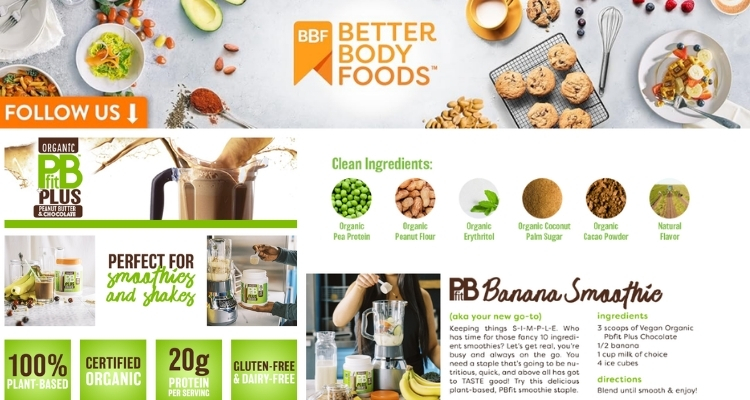
Better Body Foods
Better Body Foods structures its A+ Content around a common barrier for specialty ingredient purchases: customers often hold back because they are unsure what to do with the product. The content addresses this directly with a visual spread of finished recipes, all photographed in a style that fits the season the content was built for.
This approach works because it does not just describe the product. It extends its value. A customer who starts with one intended use case walks away with multiple reasons to buy, and the lifestyle imagery reinforces an association between the product and an outcome they already want.
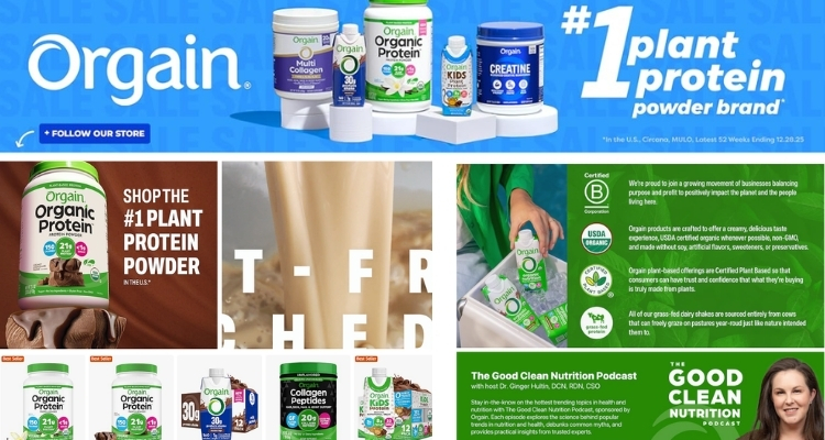
Orgain
Orgain opens its A+ Content with a sustainability statement placed above the brand logo, a deliberate structural choice that signals exactly who this product is for before anything else is communicated. The content then supports that positioning with specific language and measurable proof points, giving the value statement credibility rather than leaving it as a surface-level claim.
For brands competing in a crowded category, leading with a shared value rather than a product feature is an effective way to self-select the right audience at first glance. Customers who identify with that value are more likely to read further and, as a result, more likely to convert.
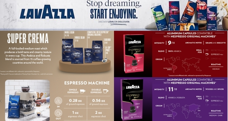
Lavazza
Lavazza uses its A+ Content to build a complete product profile within a compact, well-organized layout. The modules cover aromatic notes, preparation method, and brand history without becoming dense, keeping each section short enough to scan rather than read in full.
Importantly, the content opens by anchoring the brand in 125 years of Italian craftsmanship, a credibility signal that addresses brand trust before any product detail is presented. For heritage brands or any seller with a meaningful backstory, surfacing that context early does the trust-building work that frees the rest of the content to focus on product specifics.
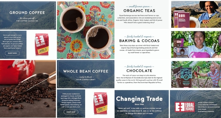
Equal Exchange Coffee
Equal Exchange builds its A+ Content entirely within a consistent visual system. Every module uses the same full-width layout format, and the brand’s signature colors thread through each image to make the full page feel unified rather than assembled from separate parts.
Beyond the design consistency, the content speaks directly to the values its customers hold, centering the sourcing story and cooperative ownership model as primary selling points rather than footnotes. For mission-driven brands, this structure works because the brand itself becomes part of the product’s appeal, giving customers a reason to choose it that no competitor can replicate by adjusting a price or adding a feature.
How to Create Amazon A+ Content in 3 Steps
Setting up A+ Content does not require technical expertise. The entire process is managed directly within Seller Central and follows three straightforward steps:
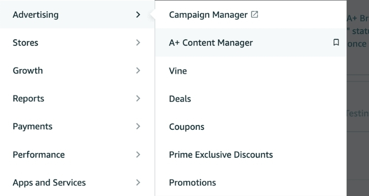
- Step 1. In Seller Central, navigate to the Advertising tab and click on the A+ Content Manager.
- Step 2. Search for a specific ASIN or product name, or create the content first and assign it to ASINs later. Then select the content type that fits your goal: Basic, Premium, or Brand Story.
- Step 3. Choose one or more modules to construct your layout. Once ready, apply the content to a single ASIN, multiple ASINs, or your entire catalog using the bulk upload feature.
Before submitting, use the preview tool to check how the content displays on both desktop and mobile. Once you submit, the content will go live after it passes Amazon’s validation review. You can return to the A+ Content Manager anytime to make edits, and if the content is not ready to publish, you can save it as a draft and come back to it later.
8 Tips for Creating Effective A+ Content
Building A+ Content that actually converts requires more than uploading a few images. The following tips cover both Basic and Premium features, giving sellers a practical framework to apply across their own catalog.
Balance Text and Photos
Images capture attention, but text is what drives the decision. Together, they reinforce each other, which means neither should be treated as secondary when building out a module layout.
- Text: Keep copy short and scannable. Use bullet points for key features and avoid grammatical errors that undermine brand credibility.
- Photos: Use professional product shots alongside lifestyle imagery. Show the product from multiple angles, and use models for apparel and accessory categories.
Sellers should avoid embedding text directly into images because when images are resized for mobile, the embedded text becomes blurry and unreadable. Additionally, all image files should be kept at no larger than 2MB to meet Amazon’s upload requirements.
Include Technical Specifications
The technical specifications module is most effective when built from the customer’s perspective. Before adding specs, sellers should consider what information a buyer would need to feel confident making a purchase.
For electronics, relevant fields typically include product dimensions, weight, battery type, plug type, and connectivity features such as Bluetooth or Wi-Fi. Other categories follow the same logic, meaning the goal is always to surface the details that matter most at the point of decision rather than listing every available attribute.
Use Comparison Charts
Comparison charts allow sellers to display key product attributes side by side, including model type, dimensions, and distinguishing features. They also create a natural cross-sell and upsell opportunity for other products in the catalog.
Both Basic and Premium A+ Content support comparison chart modules. However, Premium comparison charts go further by enabling a shoppable feature that includes an Add to Cart button, customer reviews, and live pricing directly within the chart.
For sellers managing multiple SKUs or product lines, this distinction is worth considering when deciding which content tier to invest in.
Tell Your Brand Story
The Brand Story module gives sellers a dedicated space to build an emotional connection with customers beyond product-level details. Effective Brand Stories typically cover one or more of the following:
- The origins and founding mission of the brand
- How a product has solved a real problem or improved lives
- Values the brand shares with its target audience, such as sustainability or ethical sourcing
Sellers should coordinate the Brand Story section with their existing About Us page to maintain a consistent narrative across both Amazon and external channels, since inconsistency between the two can weaken the overall brand impression.
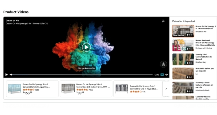
Add Product Videos
Video modules give customers a way to see how a product looks, moves, and functions in real conditions, going beyond what static images can communicate. The case for investing in professional video content is backed by clear data:
- 96.3% of customers say video is crucial when researching products before purchase
- Customers who watch product videos are 3.6X more likely to convert than those who do not
For complex products or categories where tactile experience matters, video stands out as one of the most effective tools available within the A+ Content ecosystem, particularly when other module types alone are not enough to close the gap between interest and purchase.
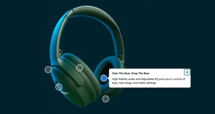
Use Hover Hotspots
Interactive hotspot modules let sellers overlay descriptive text on specific areas of a product image. When a customer hovers over a hotspot, a pop-up appears with details about that particular feature or component.
This format works well for products with multiple functional elements, since it delivers context exactly where the customer is already looking rather than requiring them to cross-reference a separate text block.
Try Clickable Carousels
Carousels allow customers to scroll through a series of image-and-text slides at their own pace. In Premium A+ Content, carousels can span the full page width, creating a more immersive browsing experience.
Sellers can use this format to walk customers through multiple use cases, showcase product variants, or highlight complementary items from the same catalog, making it one of the more versatile modules available for cross-sell and upsell strategies.
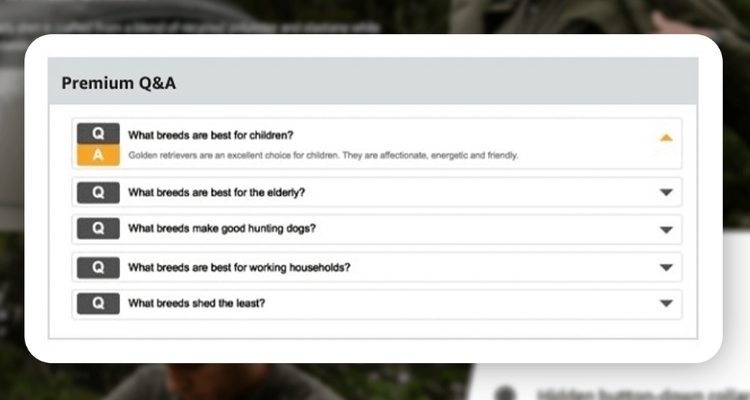
Include a Q&A Section
A Q&A section lets sellers address common customer questions directly within the listing, reducing the friction that leads to abandoned purchases or post-delivery returns. The most effective way to build this section is to review existing customer feedback and identify recurring themes around product features, sizing, compatibility, or usage.
By answering these questions proactively within the A+ Content layout, sellers give customers the information they need to buy with confidence, which in turn lowers the likelihood of returns driven by unmet expectations.
FAQs About Amazon A+ Content Examples
Yes. According to Amazon’s internal data, Basic A+ Content can increase sales by up to 8%, while Premium A+ Content can lift sales by up to 20%.
Sellers cannot include pricing, promotional details, competitor comparisons, warranty information, QR codes, or hyperlinks. Claims like “best-selling” or “top-rated” are also not permitted.
Basic supports up to 5 modules per ASIN with standard text, images, and charts. Premium expands to 7 modules and unlocks additional features, including video, interactive hotspots, carousels, Q&A sections, and shoppable comparison charts.
Get Professional Help from Megaficus
Understanding how top brands approach Amazon A+ Content examples gives sellers a clear blueprint for building listings that convert. From choosing the right modules to crafting a layout that guides buyers toward a decision, every element plays a role in the final result.
If you need expert support to build or optimize A+ Content across your Amazon store, the team at Megaficus is ready to help.